Streamlining Processes
Design like your users can’t remember
Introduction
I worked on this UX/UI project while employed as a front end developer, more so than a designer. This was prior to my formal UX designer so not all steps of the design cycle are present and the visuals are not of the same aesthetic calibre as my other work. The company is a marketing data company that deals with coupons and promotions and this project deals mainly with the internal platform used by its employees.
Problem
After working at the company for several months, I encountered a great deal of UI problems that made work difficult. Many problems were small user interface problems that broke standard UX practices and combined to make the entire process very memory-reliant and inefficient.
This problem meant that it took a while to onboard our new account managers who would use our platform to set up campaigns for our clients. Many of the processes required a lot of memorization and were tedious to go through, with multiple clicks. People also made mistakes commonly, not only because of confusing layouts, but because of reasons like small, closely-set buttons being hard to click.
User research & Usability testing
While much of the inspiration and discovery of the problem stemmed from my personal use of the platform, I also observed my sales and account manager colleagues using the platform while I helped them debug front-end problems. From this I gained more insight into their difficulties as well as validation that I was not the only one encountering these issues.
Design Issues
There were two main, interrelated design issues: recall over recognition, and tedious user flows:
1. Recall over recognition (cognitive overload)
In a reversal of the usability design principle of recognition over recall, the company’s internal platform required users to remember various codes, processes, and inconsistencies.
Multiple terms & inconsistent layouts
In the platform, various items would change names from stage to stage. For example query strings might be called SUC in one place and would become UID later, or in one very confusing idiosyncrasy, users had to learn that these codes that mapped promotional barcodes to coupon text were mapped like this:
promocode2 –> text2
promocode3 –> text3
BUT
promocode –> text4
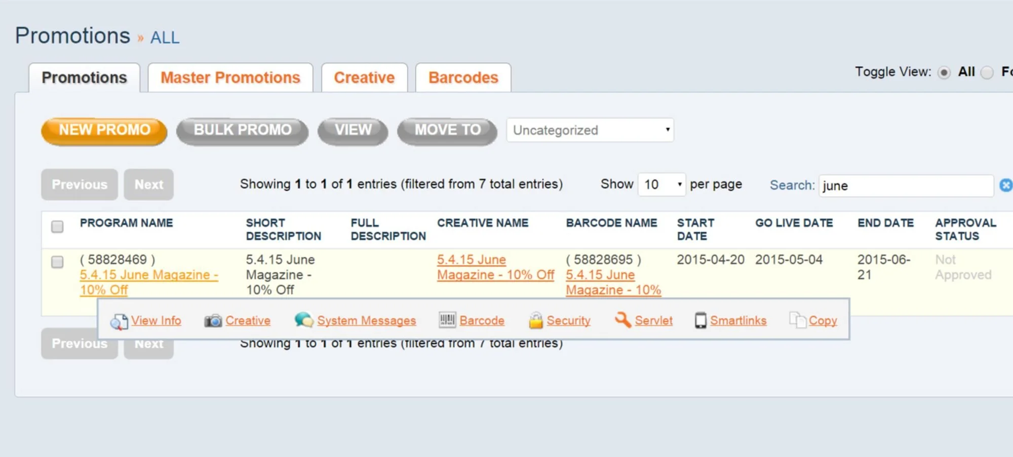
In another case, while the main navigation bar was displayed in a particular sequence on one screen, it was displayed in another sequence elsewhere. This would often lead to clicking the wrong item.
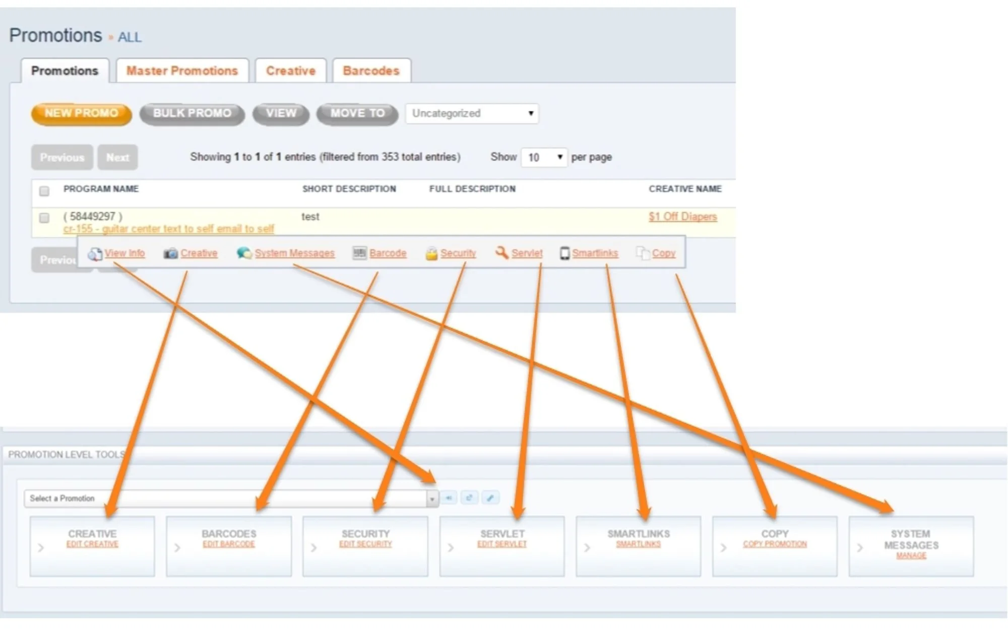
The main tools changed position depending where you accessed them.
Unintuitive flow & design patterns
Another problem was confusing UI and user flows. Much of the platform’s user interface seemed to be hastily put together, resulting in user flows that run counter to users’ thought processes.
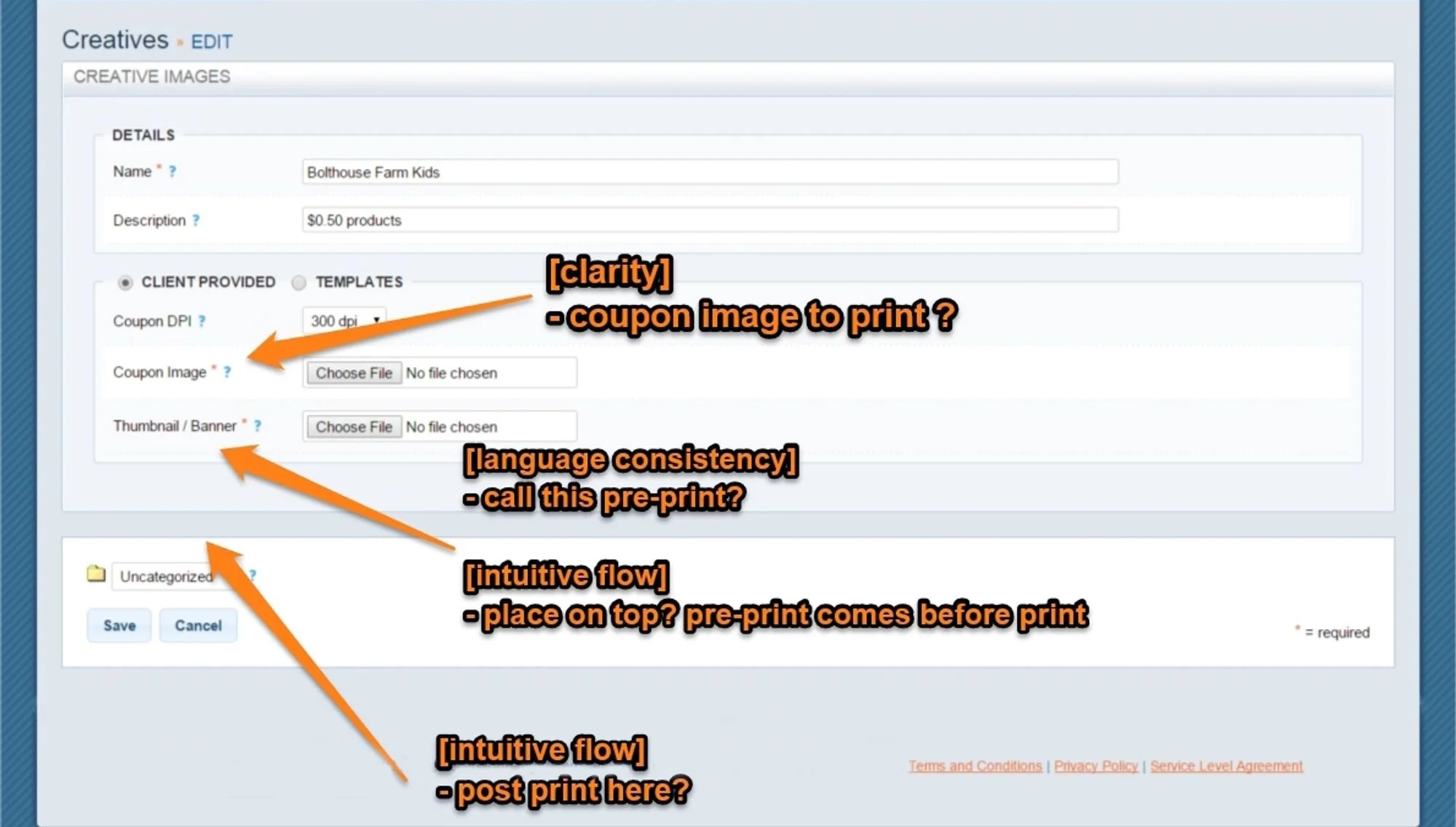
When creating a creative, users would put in the visual precedes the printed coupon AFTER the coupon image. Besides that, this section featured multiple terms for various items that differ from the terms used elsewhere.

In some screens, greyed-out options were in fact clickable, and when clicked, they revealed completely hidden UI elements.
2. Tedious or taxing processes
Another major set of issues was the number of processes that required a large number of clicks that could otherwise be automated.
Multiple screens and clicks
Many times, users would go through several screens selecting identical items, or even sometimes all items (without a ‘select all’ button).
For example, users needed a certain promotional URL with query strings, but to access it, the process was as follows:
click url generation link, resulting in a popup that appears at the top of the screen.
copy url
move cursor up to the top of the screen to close the popup
move mouse to address bar
paste link & refresh
Physically difficult UI
At other times, the buttons were too small or close together, resulting in accidental clicks and several attempts before successfully selecting the right item.
This hovering navbar’s thin design meant that users often moved their cursors out of the bar, causing it to disappear, forcing them to start again. Items at the far right of the navbar were the most difficult to reach.
Epilogue
I gave a presentation of my findings to the product team of which I was a member. They quickly implemented some changes, such as increasing the width of the hovering navbar. I also coded up a template generator for certain generated URLs which was used as a supplement to the platform. Other changes came later and gradually as the programming was changed to make the platform more user-friendly.