Continuo: Optimizing Usability and Revenue
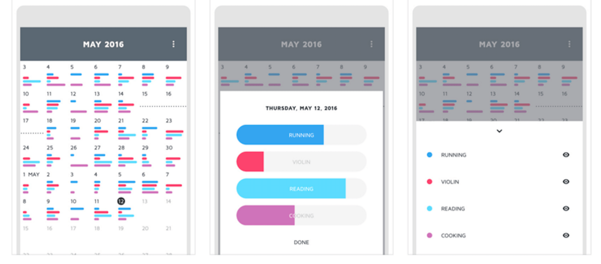
Example Continuo screens from the Apple iTunes Store
I was in the middle of replying to his email when it hit me: why tell, when you can show? Besides, this could be good experience for a beginning UX design professional.
Prologue
I’m always seeking new ways to streamline my life and be productive, at times I even write about it! That’s why I’m always downloading and trying out new apps. Earlier this year, I tried an app called Continuo that tracked your activities. Activity productivity trackers are a dime a dozen in the iTunes store, but this one seemed different. It had bars in place of the usual checkmarks for a completed activity. This let you indicate the magnitude of completion for your tracked activities. This was slightly confusing but still an interesting idea.

A screenshot from the Continuo page in the iTunes Store
However, the more important problem was that I could not find how to create new activities and was just stuck with the one I got onboarded with. After trying it for a while but ultimately failing to find how to create new activities, I left some feedback on the app store regarding the app (I think I gave it three or so stars, as well as leaving a comment about the UX and usability issues regarding the bars and adding the activity.
Being asked for feedback
I thought that was the end of that, but the next day, the app’s developer and designer contacted me asking me for feedback saying:
I was wondering if you’d be willing to give me a little more information, which might help me improve the app. Were you able to find the activity menu arrow at the bottom of the screen, and create a new activity?
I was in the middle of replying to his email when it hit me: why tell when you can show? This could be good experience for a beginning UX design professional. I had at the time just graduated from General Assembly’s User Experience Design Immersive, after having taken it to move into the design field from a development background.
Testing and redesigning for usability
I started off with usability testing, having a couple of family members who were visiting at the time be UX guinea pigs for my usability tests (in a real world project, I’d use a more diverse sample, but this was not a paid project, and my family members were right there!). I created a couple of user tasks related to creating, tracking, and reviewing activities. I videotaped them, reassuring them this would not be publicly available, and recorded only the screen and their hand movements, as well as the audio. The results showed that the main problems revolved around usability, with creating activities being a major problem area.
Problem 1: Hidden done button
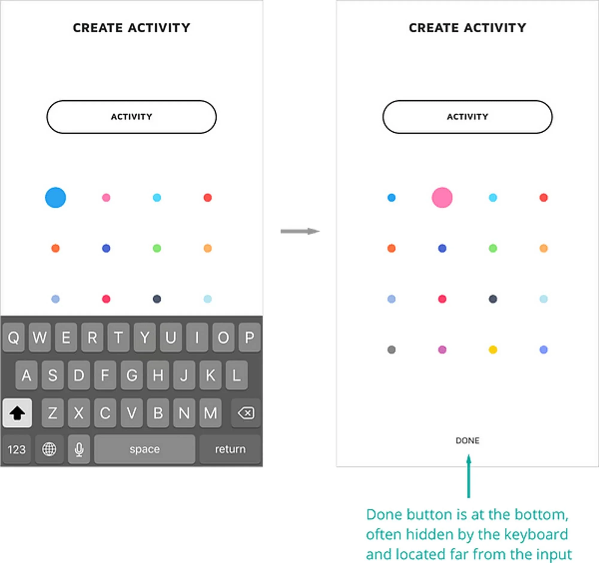
The activity creation screen has the ‘done’ button on the bottom, which is obscured when you select the input to give the activity a name. The keyboard does retract to reveal the ‘done’ button upon pressing the ‘return’ key, but discovering this was not common. Because of this, the create activity task is a rather disjointed experience.
Proposed Solution: moving the ‘done’ button up
My solution to this was to move the ‘done’ button to the top, under the activity name input. This serves two functions:
The keyboard no longer hides the button, making the user’s path clear.
It more more closely indicates the relation between the two elements.
In addition, I made the ‘done’ button grey when the input is not filled, to leverage a common UI pattern that shows that additional info is required to continue — in this case, an activity name.

With my proposed solution the user is less likely to be confused and is also saved several steps when creating an activity.
Problem 2: Tiny, unclear action button
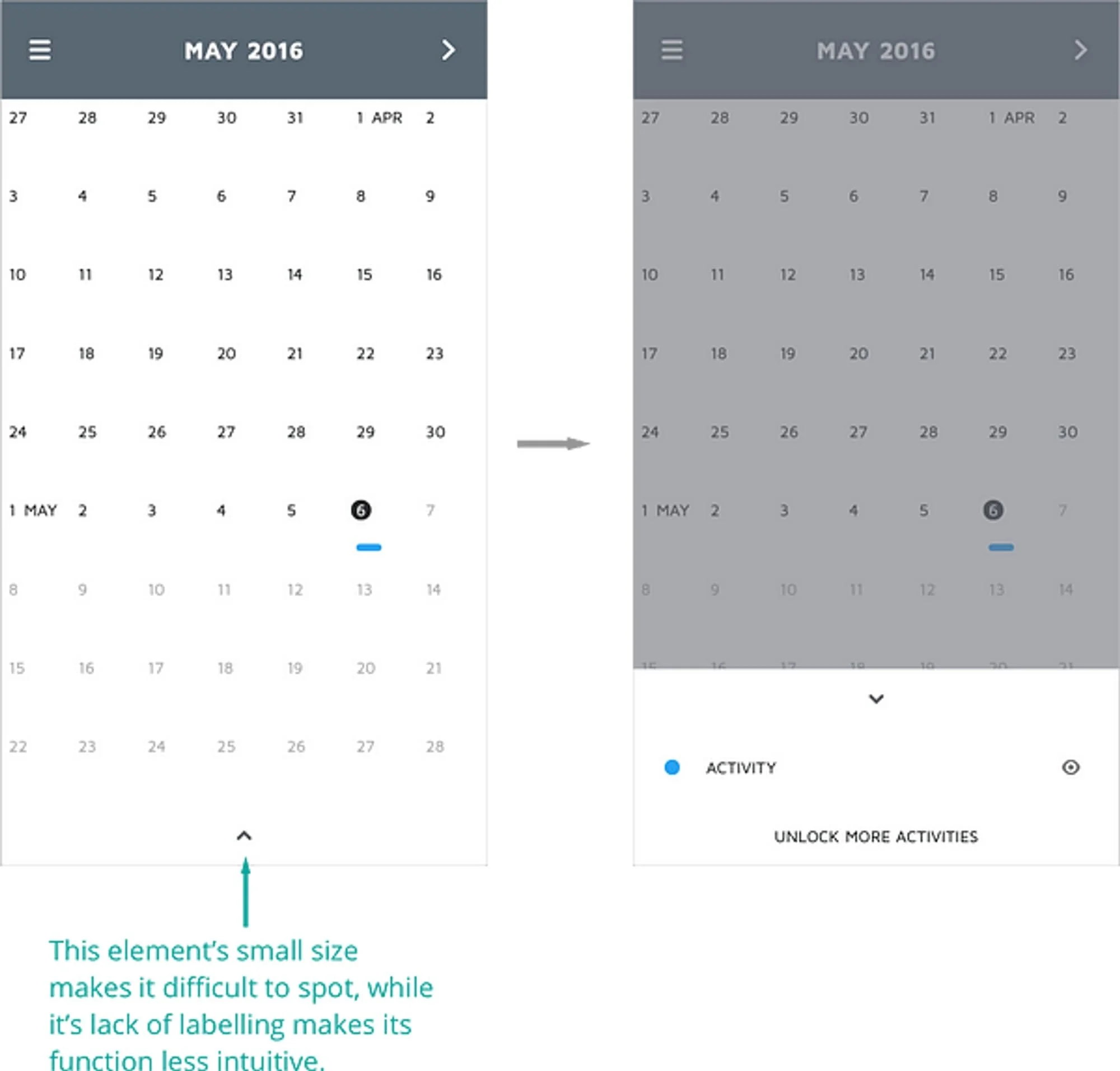
To access the activities tab, you tap the tiny up arrow. While this design is minimalist and sleek, it is unclear what the arrow does. Beyond that, it was very hard for users to spot in the first place!
Proposed solution: Labelling the arrow
Sometimes the best icon is a label, and this is especially true in this case. Not only does this inform the user what the button does, it makes it more visibly conspicuous in the first place.
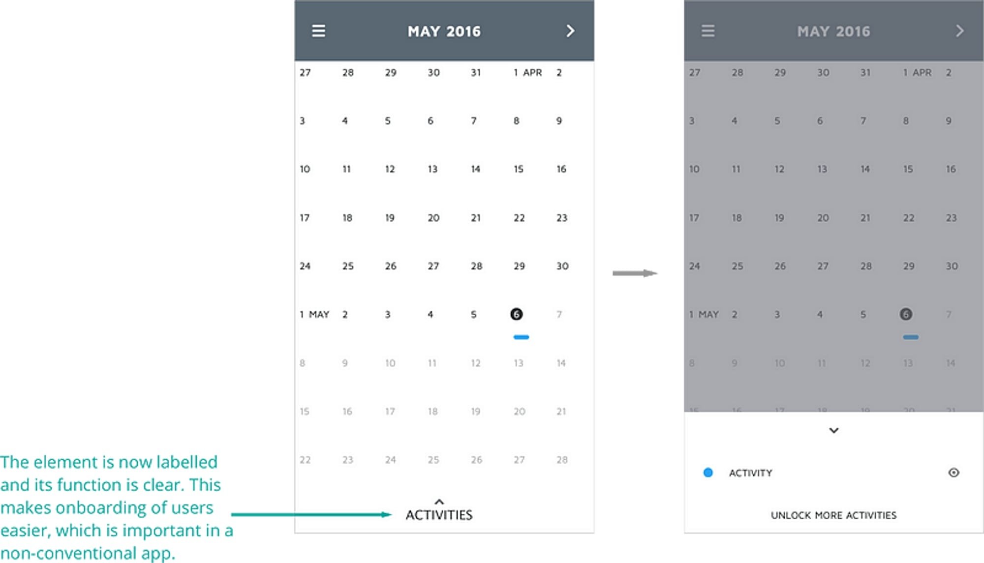
Problem 3: Dead end roads for creating activities
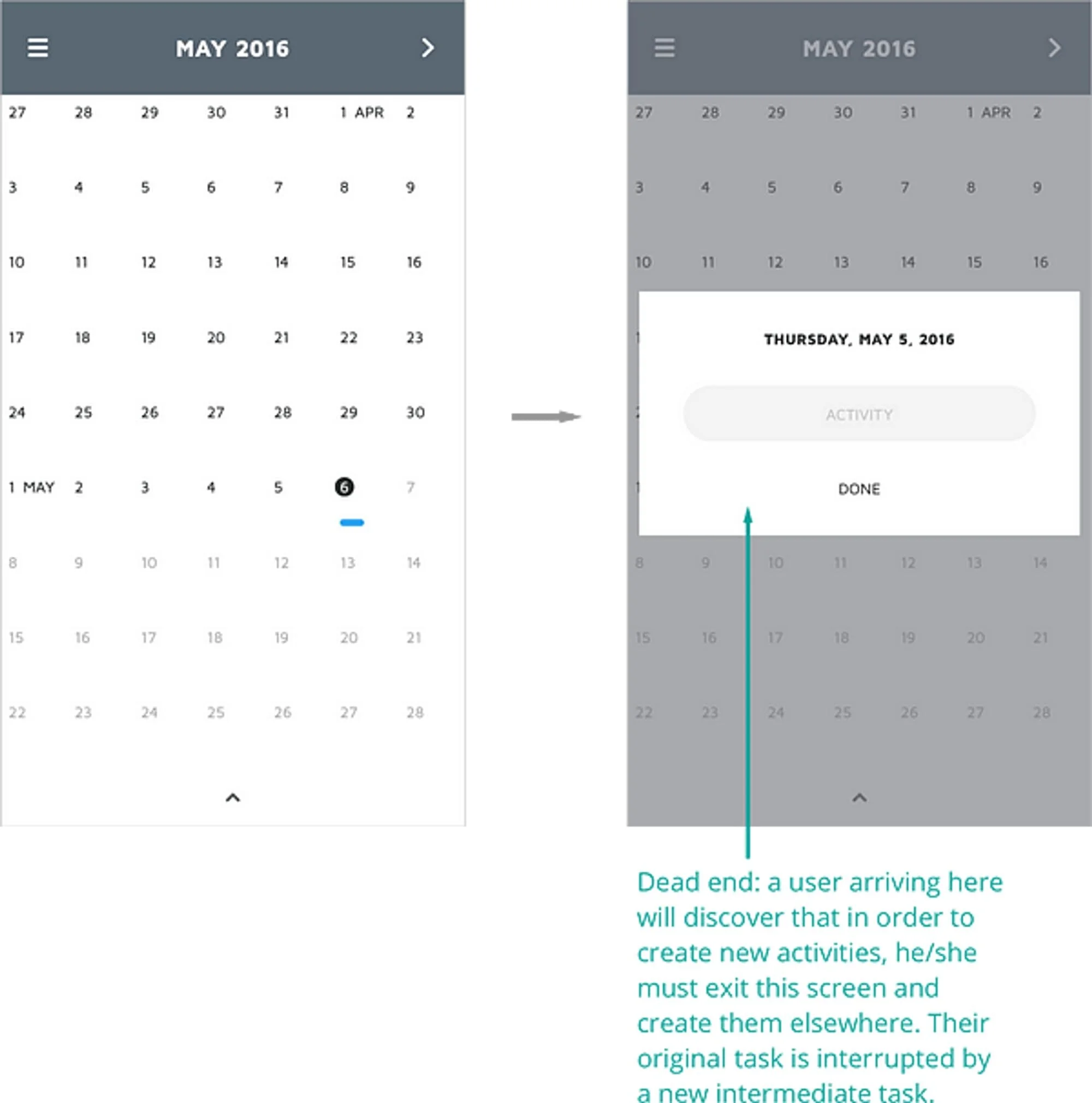
The third problem also revolves around creating activities. When a user selects a date, the activity overlay appears, but there is no option to create a new activity that the user hasn’t tracked before. The user would need to leave the screen and go to another screen to create the new activity before returning here to track it.
Proposed solution: Providing an option to create a new activity while tracking an existing activity.

By providing an option to unlock more activities, the has the option to create activities as well as generating more revenue for the developer.
There is a concept in UX design where you want to provide the appropriate information at the time the user needs it, similar to how at diverging corridors in airports, signage should be present to guide users to their destination. Here, by adding the option to unlock more activities, users know that this is where they can create more activities, that these are paid activities, and the developer can earn more money from in-app purchases as well. The user does not need to exit the screen to create new activities and does not incur a cognitive switching cost. This user flow is analogous to the option to add another option of their own to a dropdown if an appropriate option is unavailable. This allows for greater user freedom and improved error prevention.

The proposed solution removes the need for users to backtrack and circle back to add new activities.
Epilogue
I sent the feedback to the developer, along with a few other minor problems I identified such as readability issues and onboard swiping indicators being missing, which led to some user confusion in my tests. The developer responded with surprise at the amount of work I put in as well as gratefulness. He also agreed with some of my analyses and said he would make some of the changes like the hidden done button. However, for some of the other problems, not enough users in his tests had difficulty with the problems I discovered so the feature would remain the same, but thanked me for my feedback.