Linkedin Projects
A Platform for Projects

Overview
This time around, we were placed in groups with similar interests. We identified a problem and chose a company well-suited to address the problem. In the end, we created an native iOS app that leveraged LinkedIn’s brand to connect people who want help on realizing their side projects and passion projects and those who want to gain professional skills and experience by working in projects.
Problem
From initial user research, we discovered the following problems:
1. People wanted to learn new skills and gain professional experience but aside from applying to a job and committing large amounts of time and efforts into learning programs or work or internships, there wasn’t much opportunity to have a lower cost opportunity to do so.
2. People had side projects they wanted to work on but it was often finding the necessary people to supplement or complement their own resources.
Opportunity
From these somewhat different ideas we noticed an opportunity to connect these two types of people: people who need help on passion projects would benefit from having more helping hands, while people who needed work experience could learn from working on these projects.
Research
With an initial direction, we started to research the competitive landscape and users, before synthesizing the data to glean insights.
Competitive Analysis
It was difficult to find competitors who did what our LinkedIn extension platform would do, specifically does so our competitive research focused on a variety of competitors. We researched mentoring websites such as Mentor.org and collegementors.org for the learning and teaching aspects and roles that people who created projects with people to join would probably have. We compared the smartphone apps Shapr and Grip which were business-oriented networking apps to study how people may connect. And we compared portfolio websites such as Bechance and Coroflot in order to see how portfolios and designs were shared and presented online to gain inspiration on how to design our app.

User Research
We used both surveys and in-depth interviews for a mix of quantitative and quantitative data. From our research, we found a variety of interesting ideas. Many people learned and honed professional skills best by applying their skills in making projects. People also mentioned that they liked structured learning, and some tied this structure to working on a project. Furthermore, many of the same people mentioned that they found working in groups helped them consolidate their knowledge and foster a sense of community that was conducive to improving. Finally, a couple of people mentioned they made their own passion projects and learned a lot through doing these.
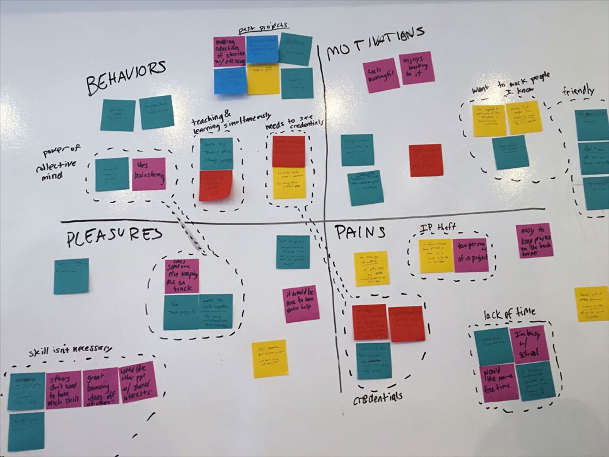
Data Synthesis and Pivoting
Using this research, we synthesized the data via affinity diagramming. The initial look was unpromising. We had wanted to connect people for private or group tutoring sessions. However, our data could not indicate any desire for connections this way. In addition, there were many established tutoring avenues people could take to learn things. Fortunately, we noticed a little insight that we had jotted down that had heretofore been ignored: people who made passion projects. With this flash of insights, we connected the dots: we could have two types of users, one user who had passion projects and needed people’s help on them, and the other user, a person who wants professional skills but may find it difficult to get actual experience applying those skills he or she is learning. With this in mind we went back screened people again for people who did passion projects (since this wasn’t in our original screener) and conducted a second round of interviews with project creators to learn more about them, as well as learn more about our original skill-learners.
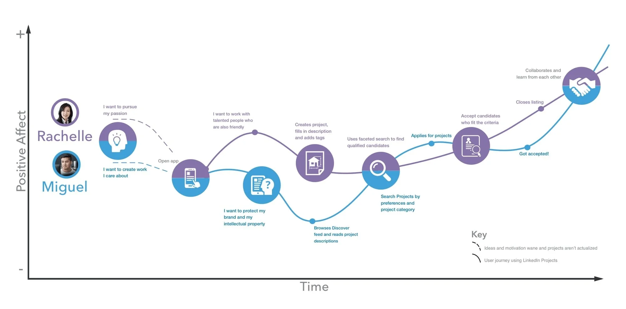
Slowly we began to see a picture emerge of our core users. We created a two main personas: one person who wanted to learn and improve his skills professionally, and another who liked working on projects both for the projects’ sake and also to see her projects realized.
User Stories & Feature Prioritization
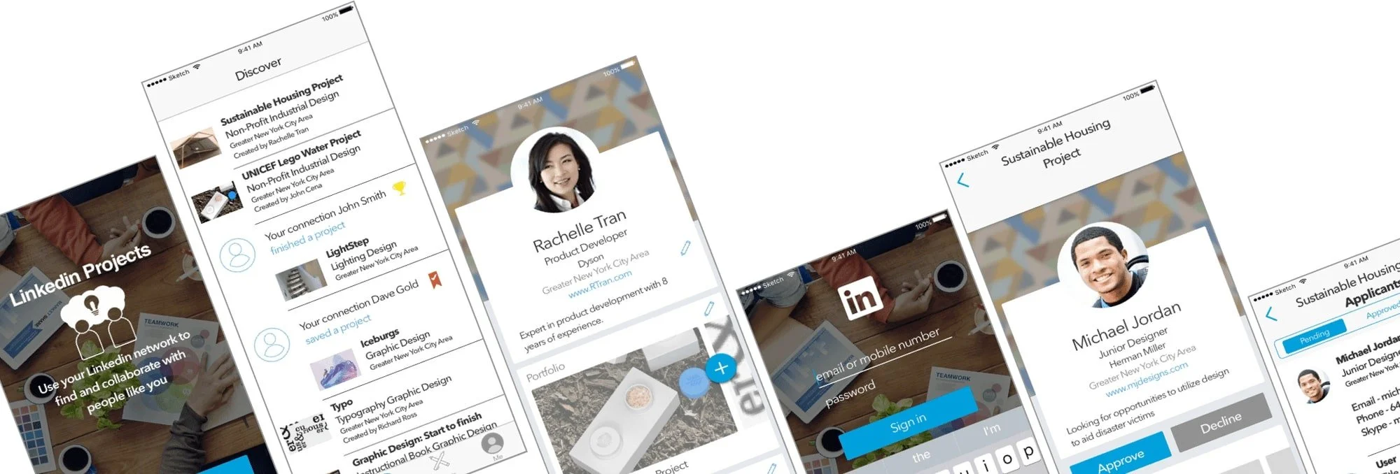
With any project, it is important to prioritize which features to work on first. Looking at our personas, we thought up features and listed them out in a MoSCoW chart, also known as a must, should, could, and would chart. Our MVP features were those in the must category, and included basic way to create, find an apply to a project. The should and could features included more advanced ways of managing and collaborating on a project. Finally, we decided against deciding any monetary features since this should be left to LinkedIn’s business development team.

Object-oriented UX planning and designing
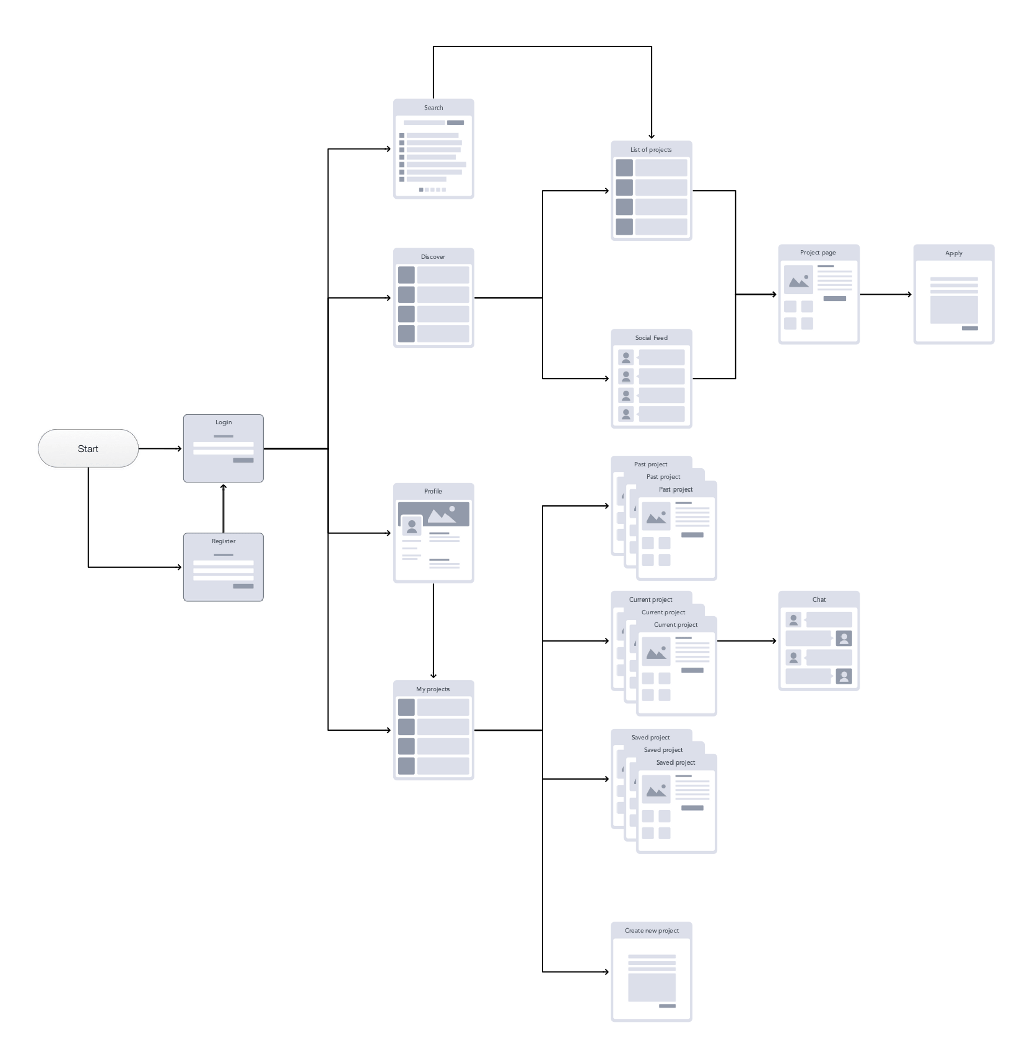
Having defined the features we wanted to create, we decided to map out the various features on various app pages before we set about designing those pages. I figured this would be a more efficient way to get everyone on the same page (pun seriously not intended). If we did not all agree on what would be on each page and started designing, we would be working on numerous items at once, and pages would fundamentally be different due to differing compo
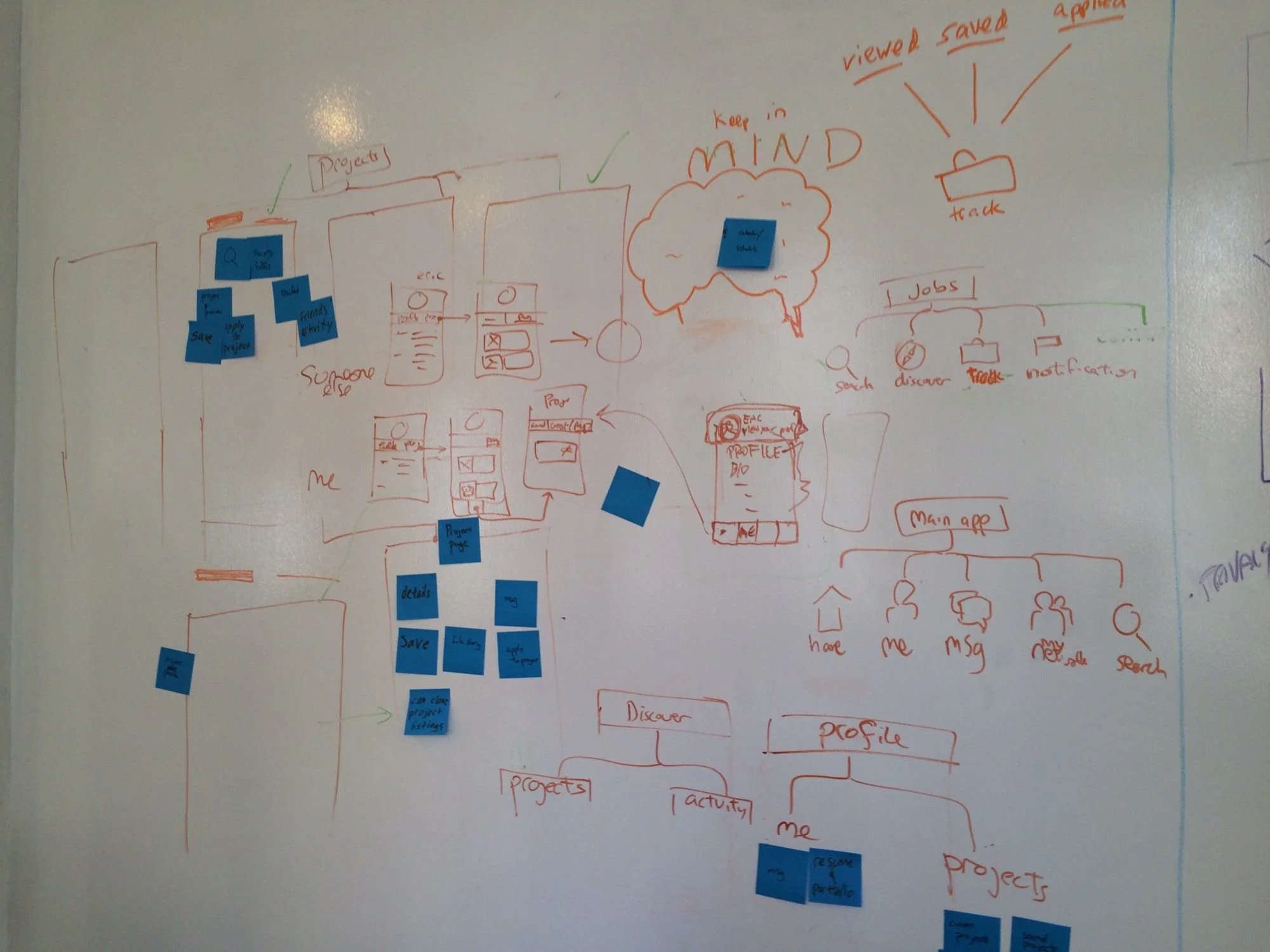
We first translated each feature into a UI component and written on a post it. Next we conducted a sort of within-team card sort where we sorted each UI component into groups which represented pages. Afterwards, we looked through these groupings before finally naming what each page was. While doing this, we also identified how each component interacted within and between each page. The resultant diagram was essentially a high level rough sketch of an app map that showed the informational architecture of the app.
Having agreed on the components of each page, we started sketching out each app page. We conducted design charrettes, time-boxing our design sessions into short intervals of around 3–5 minutes. By time-boxing, we forced ourselves to pick out and focus on communicating the most important aspects in our design. We would then pitch it to our group members and iterate our designs based on feedback and seeing our teammates’ designs until we achieved consensus on an outline, although the finer details would be added later.
Designing & Testing
After this, we started wireframing in medium fidelity so that we could start creating the prototype and testing our design. To help visualize and remind us how the app would flow, I created an app map to help guide us while creating the wireframes. One of my teammates was in charge of creating the wireframes and created a medium fidelity wireframe which we then put into InVision and tested while he started working on the High fidelity prototype. This way we could parallel process and save time.
We tested initially and our initial feedback was mostly aesthetic, although one issue of information visual hierarchy stood out, which we updated in the higher fidelity session. We continued testing in the higher fidelity mockup while iterating. I used an iPad to directly mark up on a PDF of our wireframes and hand it over to our wireframing teammate.

Overall
Overall, this project was a very enjoyable experience that afforded me many learning experiences and reference points. It exposed me to another group dynamic, that of similar thinking styles and the benefits and drawbacks that arise from this team composition. It also allowed me to further hone my strengths and work on my weaknesses to become a more well-rounded UX designer.